

Color Trends 2026: The Shades That Are About to Take Over Every Runway You Care About
By a fashion-obsessed writer who spent way too many hours down a Pantone rabbit hole — and honestly has zero regrets about it.
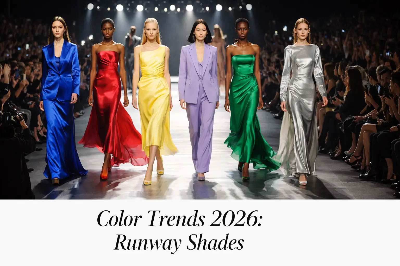
Color Trends 2026 are hitting different this year. I don’t say that lightly. Every January, I sit down with a strong cup of coffee — the good stuff, not instant — and I go through runway recaps, designer notes, and color forecasting reports like I’m studying for an exam. This time around though? I genuinely got goosebumps. And I’m the kind of person who thought “millennial pink” was overrated by 2017.
There’s something electric happening in fashion right now. After years of “quiet luxury” and beige-on-beige minimalism — which, fine, I get it, very chic — designers seem collectively ready to make some noise. Consequently, the palettes emerging from Paris, Milan, New York, and London for 2026 feel both surprising and, weirdly, inevitable. Like when your favorite band drops an album and you think, “Of course. This is exactly where they were headed.”
So let’s get into it. Because honestly, whether you’re a devoted fashion follower or someone who just wants to know what color to paint their bedroom without looking like they’re stuck in 2019, this breakdown is for you.

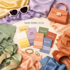
Color Trends 2026 Are Saying Goodbye to the Beige Era (Finally)
Color Trends 2026 officially mark the end of what I’ve been calling the Great Beige Hostage Situation. You know what I’m talking about. The past few years were genuinely dominated by greige walls, oatmeal sweaters, and every influencer’s apartment looking like it was designed by the same algorithm. And look, I wore my share of neutral tones. I’m not throwing stones from a glass house. But the runway doesn’t lie.
What’s replacing the beige obsession isn’t chaos — it’s something more interesting. It’s intentional richness. Designers are reaching for depth, for complexity, for colors that feel like they have a story behind them. Furthermore, there’s a real sense of emotional weight to the palettes being presented. These aren’t just colors. They’re moods. Statements. Sometimes arguments.
Here’s a fun little niche fact for you: color forecasters typically work 18 to 24 months ahead of actual runway seasons. So what you’re seeing on catwalks right now for 2026 was essentially decided back when most of us were still arguing about whether that dress was blue or gold. The process involves trend analysts, textile manufacturers, cultural observers, and — I kid you not — people who literally track what colors appear most in museum exhibitions and street photography across major cities. Fashion is genuinely wild.
Color Trends 2026 Spotlight: The Deep Plum Renaissance
Color Trends 2026 absolutely cannot be discussed without starting with deep plum. This isn’t your grandmother’s purple — though hers was probably amazing — this is something richer, darker, and a little intimidating. Think eggplant at midnight. Think a velvet blazer that makes people ask where you got it and then look slightly annoyed when you tell them.
I first started noticing this shift on the Valentino and Bottega Veneta runways, where purple-adjacent shades were showing up not as accent colors but as full looks from head to toe. That’s significant. Accordingly, when a house like Bottega commits to a single deep tone for an entire silhouette, you know they’re making a point. Additionally, the street style coming out of Milan was drenched in it. Not in a matchy-matchy way — more like everyone independently decided that yes, this was the vibe for the decade.
There’s actually a fascinating historical reason why purple keeps cycling back into fashion consciousness. For centuries, true purple dye — specifically Tyrian purple — was insanely expensive to produce, derived from a species of sea snail called Murex. Consequently, it became synonymous with royalty and power. Cleopatra reportedly soaked her ship’s sails in Tyrian purple. When synthetic dyes democratized the color in the mid-1800s, that connection to power didn’t disappear. It just became more accessible. Fashion has never fully stopped exploiting that psychological shorthand.
How to wear it without looking like you’re auditioning for a period drama? Start with one piece. A deep plum coat over all black is genuinely one of the best looks I’ve seen this season. Simple, clean, very “I know exactly what I’m doing.”
Color Trends 2026 Feature: Warm Rust and the Return of Earth’s Favorite Shade
Color Trends 2026 wouldn’t feel complete without addressing rust. Now, before you groan — I know, I know, burnt orange has been “having a moment” for what feels like a decade — hear me out, because what’s happening with rust in 2026 is different. It’s warmer. More textured. Less pumpkin spice, more actual iron ore.
What makes this iteration of rust special is how designers are pairing it. Instead of grounding it with neutrals, which was the move in the early 2020s, the new approach involves combining rust with unexpected complementary tones. Cobalt. Forest green. Dusty rose. At first glance these combinations sound questionable. In practice? Genuinely breathtaking. I’m not exaggerating when I say I saw a rust-and-cobalt look from a relatively unknown Copenhagen-based brand that stopped me dead in my tracks while scrolling at 11pm.
The psychological pull toward rust and earthy tones is also tied to what color psychologists call “grounding” — the instinctive human attraction to colors found in natural landscapes, particularly when cultural anxiety is high. Make of that what you will, but it tracks. Furthermore, rust has a genuinely democratic quality — it works across skin tones in a way that many trendy shades simply don’t. This is something I wish more fashion coverage would actually discuss honestly.
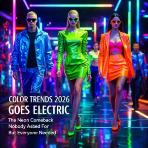
Color Trends 2026 Goes Electric: The Neon Comeback Nobody Asked For But Everyone Needed
Color Trends 2026 include something that genuinely surprised me when I first encountered it in the pre-season reports. Neon. Yes, neon is back — but not in the way your 2013 festival photos would suggest. This isn’t neon as maximalism for the sake of it. This is neon used with almost architectural precision. Single neon elements in otherwise subdued outfits. A neon yellow seam on a charcoal overcoat. An electric lime pocket square in a navy suit. Neon as punctuation rather than the entire sentence.
The specific neon shades dominating? Electric lime and hyper-coral are showing up most consistently. There’s also an interesting subset of “digital neon” — colors that look like they were lifted directly from a high-resolution screen. This makes sense given the growing overlap between digital fashion (yes, NFT couture is still a thing that fashion houses are exploring) and physical runway aesthetics. Additionally, Gen Z’s influence on color sensibility is undeniably pushing things toward the more saturated end of the spectrum.
Here’s my honest take: I was skeptical. I’m still a little skeptical. But I tried adding a single neon element to my wardrobe — a bright lime green scarf — and three separate people asked about it within a week. So. There’s something to this, however annoying it might feel to admit.
Color Trends 2026: The Quiet Power of Dusty Blue and Slate
Color Trends 2026 carry a quieter hero that deserves more attention than it’s getting in the hype cycle: dusty blue. Not denim blue, not cobalt, not navy. Dusty blue — that slightly faded, slightly gray, vaguely melancholic shade that somehow manages to be both understated and memorable.
I have a deeply personal connection to this color, which feels ridiculous to admit but here we are. My grandmother had a coat in this exact shade that I coveted for years. There was something about its quietness that felt more elegant than anything louder. So seeing it come back on runways at Dior and Jil Sander feels, I don’t know, validating in a way that probably says too much about me.
The reason dusty blue works so consistently is that it occupies a rare middle ground — it reads as cool-toned enough to feel contemporary but warm enough to be approachable. Moreover, it photographs beautifully in natural light, which in an era where Instagram still dictates purchasing decisions whether we like it or not, matters. A lot. Slate gray is its close cousin in this trend, particularly in tailoring. A slate gray suit in 2026 is basically the new navy.
Color Trends 2026 and the Cultural Forces Driving the Palette
Color Trends 2026 don’t emerge from a vacuum, and this is the part most fashion coverage glosses over in favor of just listing pretty shades. So let’s actually dig in, because this is where it gets interesting.
First: the ongoing influence of K-pop and Korean fashion on global color sensibility cannot be overstated. Seoul Fashion Week has become genuinely must-watch for trend watchers, and the color palettes coming out of brands like Gentle Monster, Ader Error, and designers like Juun.J are filtering upward into European luxury houses faster than ever before. The dusty, muted tones mixed with sudden neon accents that are showing up in Paris? Trace it back to Seoul. Consequently, there’s a beautiful globalization happening in color that’s more complex than Western trend forecasters typically acknowledge.
Second: environmental consciousness is shaping color in a more literal way than you might expect. There’s a growing movement among sustainable fashion designers to use only pigments derived from natural sources — plant-based dyes, mineral pigments, even some insect-derived colors (yes, really, it’s been done for centuries and it’s having a small artisan revival). The colors these processes produce tend toward specific ranges: deep indigo, warm madder red, soft weld yellow, and various earthy ochres. Interestingly, these naturally-constrained palettes are feeding directly back into mainstream trend forecasting. Furthermore, the imperfection inherent in natural dyeing — the slight variations, the irregularities — is influencing the overall aesthetic toward something less artificially perfect.
Third — and this one’s my own observation from an admittedly obsessive amount of cultural consumption — there’s a nostalgia for 1970s color palettes that keeps resurging. Not in a kitschy way, but in a genuinely studied way. Designers are going back to that decade’s archives and pulling out color relationships that feel simultaneously retro and fresh. The 70s were, arguably, the last decade before corporate color consulting truly standardized the palettes available in mass fashion. There was a weirdness to them. A willingness to put brown and orange together without apology. That spirit is very much alive in 2026.
Color Trends 2026: A Practical Guide to Actually Wearing These Shades
Color Trends 2026 are genuinely exciting, but knowing something is trendy and knowing how to incorporate it into your actual life are completely different things. So here’s the practical bit.
The deep plum situation is easiest to start with if you’re nervous about bold color. A plum cashmere turtleneck, a plum wool coat, or even a plum handbag against an otherwise neutral outfit — any of these works without feeling costumey. The key is quality fabric. Cheap plum looks cheap. Quality plum looks intentional and expensive. This is just facts.
For the rust trend, if you’re already wearing earthy tones regularly, this is almost a non-event — just go deeper and more saturated than you normally would. If you’re more of a black-and-white person, one rust piece is enough. A rust leather bag, rust boots, rust knit. Let it be the conversation piece and keep everything else simple.
Neon is, admittedly, the trickiest. My genuinely useful advice: don’t try to go neon all-in unless you really, truly, deep in your soul want to. That usually goes badly for most people. Instead, use neon as an accent in accessories — a watch strap, a scarf, a bag liner, a shoe detail. You’ll be in the trend conversation without committing to something you’ll hate in three years.
Dusty blue and slate, though? These are the genuinely wearable heroes of 2026. Universally flattering, versatile enough to go from office to dinner, and unlikely to date badly because they’re grounded in classic tones. Moreover, if you’re gonna make one wardrobe investment this year that you won’t regret, a well-cut blazer or coat in dusty blue is, in my opinion, the move.
Color Trends 2026 in Home Decor and Beyond the Runway
Color Trends 2026 don’t stay on runways. They never do. Within 12 to 18 months of a color dominating fashion, it typically shows up in home decor, product design, graphic design, and even car color options. So if you’re thinking about repainting a room or buying furniture anytime soon, this section is for you.
Deep plum walls are, already, showing up more and more in interior design circles. Used as an accent wall or in a smaller room where it can create enclosure and intimacy — think a reading nook, a home office, a powder room — it’s genuinely spectacular. I’ve seen it paired with warm brass fixtures and it looks like something out of a very good boutique hotel. Not a bad thing to aspire to.
Dusty blue in home decor has an interesting longevity that trendy colors often lack. It’s been a staple in Scandinavian interior design for decades — there are traditional Swedish painted furniture pieces in this exact shade going back to the 18th century, and they still look elegant today. That’s a color with staying power. Therefore, if you’re going to commit to a color-forward piece of furniture, dusty blue is among the safer bets.
Rust in home decor should be approached with slightly more care — it can veer quickly into a certain kind of generic “bohemian” aesthetic that’s been circling since around 2015. The difference is in how it’s used. Rust as a main upholstery color in a modern silhouette — a low-profile sofa, a minimal armchair — feels contemporary. Rust in a macramé-heavy, wicker-overloaded space feels stuck. The shape of the furniture matters as much as the color.
Color Trends 2026: The Wildcards Worth Watching
Color Trends 2026 have a few wild cards that aren’t dominating headlines yet but are absolutely worth watching. These are the shades showing up in smaller quantities right now but have that particular quality — call it trajectory — that suggests they’re about to blow up.
Warm silver-gray — not cold, not metallic, not quite white — is one of the most interesting shades quietly building momentum. It sits at the intersection of the previous era’s interest in soft neutrals and a new push toward something with more visual weight. It photographs like a dream, works in both fashion and interiors, and has that slightly hard-to-name quality that means it’ll get referenced constantly without people necessarily calling it by a consistent name. Similarly, a deep forest green that leans toward black is appearing more and more frequently — it’s almost the green equivalent of what dusty blue is doing.
There’s also a genuinely underreported movement around what I’d call “bruised pink” — a mauve that’s pushed further toward plum than the gentle lavenders of recent years. It appeared in several graduate collections this season, which always signals something. Graduate collections are where the unfiltered instincts of young designers show up, before the commercial pressures of running an actual brand kick in. Consequently, they’re often the most accurate predictor of where things are heading, even if it takes a few years to surface.
Color Trends 2026: What They’re Actually Telling Us
Color Trends 2026, taken as a whole, are telling a story. They always do, if you’re willing to read them that way.
The story right now is about the simultaneous desire for depth and a kind of optimistic brightness. Deep plum and forest green on one side — colors associated with interiority, with romance, with staying in and reading and taking things seriously. Neon lime and hyper-coral on the other — colors that say pay attention to me, I’m here, I’m not hiding. The tension between those two impulses feels very true to this moment, honestly. Most people I know are navigating exactly that tension in their actual lives.
Moreover, the turn toward colors with historical, cultural, or natural grounding — the rust, the dusty blue, the natural dye references — suggests a kind of reaching for meaning that pure trend-chasing has always lacked. People want their clothes to mean something right now. Not necessarily in an activist, statement-slogan way, but in a more subtle, material way. The fabric. The color. The reference. These things are feeling more important to people, and the industry is responding.
Whether or not any individual shade from this list makes it into your wardrobe is ultimately beside the point. The more useful thing is developing an understanding of why these specific colors are showing up right now, what psychological and cultural buttons they’re pushing, and what that says about the broader moment we’re living through. Fashion is always, at its best, a kind of cultural mirror. The 2026 palette is a pretty fascinating one to look into.
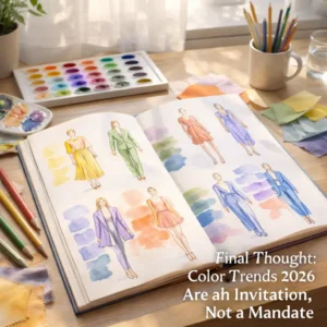
Final Thought: Color Trends 2026 Are an Invitation, Not a Mandate
Color Trends 2026 are, at the end of the day, just a starting point. The best dressers I’ve ever encountered — people whose style genuinely makes you stop and look — rarely follow trend reports to the letter. They absorb the information, they understand the context, and then they make it their own. They know which trends align with their particular energy and they ignore the rest without apology.
So. Deep plum? Try it if it speaks to you. Rust? Already in your wardrobe? Push it further. Neon accent? Maybe. Dusty blue? Honestly, yes, just do it. But more importantly, pay attention to what these colors make you feel when you try them on. That’s the actual data point that matters.
Because fashion should be fun. And in 2026, it’s finally starting to look like it again.